Almanach
Capitalics · Michał Jarociński
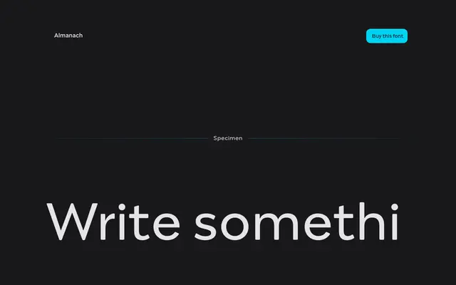
A versatile sans-serif by Michał Jarociński with softened stroke terminals and italics shaped by Italian serif conventions, covering Latin and Cyrillic scripts across ten weights.
About
Spanning ten weights from Hairline to Black, each with a matching italic, Almanach is designed for broad application without feeling anonymous. The italics follow conventions drawn from Italian serif typefaces, which is especially apparent in the Cyrillic, where many characters take distinct forms from their upright counterparts. Softened letter endings and lively numeral forms give the family a quiet personality beneath its general-purpose utility.
Classification
Described as a sans-serif with softened stroke endings and italics drawn in the tradition of Italian serif typefaces, giving it a humanist character rather than a purely geometric or grotesque construction.