Artigua
Capitalics · Maciej Włoczewski
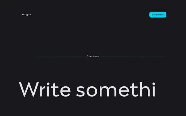
A high-contrast geometric sans by Maciej Włoczewski, with sharp terminals and a contrast ratio that eases across weights to suit both running text and headlines.
About
Designed by Maciej Włoczewski, Artigua uses geometrical forms and sharp stroke endings to create a crisp, minimal character. The relationship between vertical and horizontal stroke widths narrows progressively from Thin to Black, making the Regular weight comfortable for longer passages while the Black lends itself to headings and display use. The full 18-style family ships with over 1,100 glyphs, including small caps, old-style and tabular figures, superscript, subscript and fractions.
Classification
High contrast with sharp terminals and geometrical shapes places Artigua firmly in the geometric sans tradition, though its contrast ratio shifting across weights gives it a slightly display-oriented character at heavier settings.