Bacalar PRO
Capitalics · Mateusz Machalski
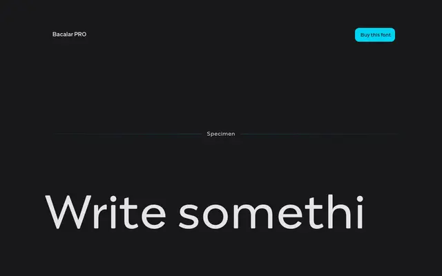
A display typeface drawn from the hand-painted signage on Yucatán colectivo buses, built across ten mechanically stretched width variants from Turbo Condensed to Turbo Expanded.
About
Inspired by vernacular lettering on public transport buses in the Yucatán peninsula, Bacalar pairs geometric forms with reversed contrast and very thin details to create a typeface that reads as deliberately confrontational. The ten styles are produced through mechanical stretching rather than optical correction, which gives the whole family a deliberately crude, brutalist quality. Designed by Mateusz Machalski of Capitalics, it suits poster, branding and signage work where blunt eccentricity is the point.
Classification
Geometric forms combined with reversed contrast and very thin details place this firmly in the display category; its brutalist, mechanically stretched width variants and vernacular Mexican bus signage origins make a vernacular display subcategory most accurate.