Balagan
Capitalics · Mateusz Machalski
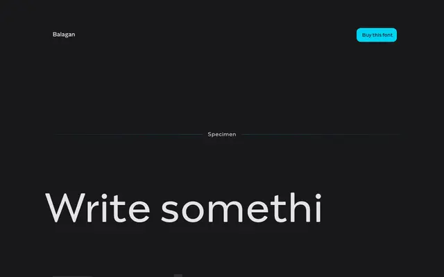
A geometric sans with teardrop-shaped counters and strong stroke contrast, designed by Mateusz Machalski for Capitalics.
About
Balagan takes its name from the Polish word for mess or disorder, though the design itself is anything but: five weights from ExtraLight to Bold form a controlled family built around soft curves and distinctive teardrop counters. The interplay between those rounded details and the underlying geometric structure creates a mild tension that keeps the letterforms from feeling purely neutral. Developed in collaboration with Weronika Kanigowska and Małgorzata Bartosik, it suits branding and editorial work where a geometric sans needs a touch of personality.
Classification
Balagan is explicitly described as a geometric sans with teardrop-shaped counters and soft curves. Strong contrasts and distinctive counters give it a geometric structure with a friendly personality.