Disalina
Capitalics · Maciej Włoczewski
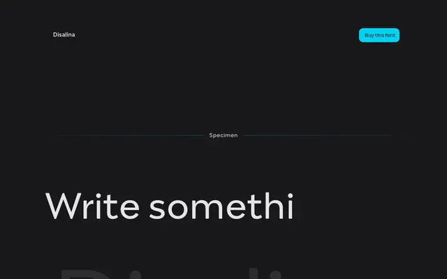
A display typeface by Maciej Włoczewski drawing on late 19th and early 20th century lettering traditions, with three stylistic sets offering geometric, ligature-heavy and Art Nouveau-inflected options across seven weights.
About
Rooted in the poster lettering of the 1800s and early 1900s, Disalina merges vintage decorative sensibilities with a more considered geometric structure. Each of the seven weights includes stylistic sets, ligatures, swashes and arrows, reducing the need to mix multiple typefaces within a single project. The result sits comfortably in branding, editorial and poster work that calls for period-inflected character without surrendering legibility.
Classification
Inspired by late 19th and early 20th century lettering and posters, Disalina blends geometric shapes with Art Nouveau stylistic flourishes, making it a display typeface with decorative historical roots.