Fliper
Capitalics · Mateusz Machalski
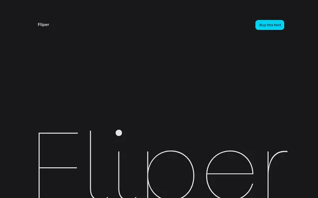
A nine-weight geometric sans with humanist inflections and stylistic sets for introducing rotated letterforms into headlines.
About
Built primarily for branding work, Fliper balances a geometric skeleton with softer, humanist detailing across nine weights from Hairline to ExtraBold, with a variable font included. Its distinguishing feature is a set of stylistic alternates that allow individual letters to be rotated, adding an expressive quality suited to headline use. Designed under the creative direction of Mateusz Machalski, with contributions from Małgorzata Bartosik, Borys Kosmynka and Weronika Kanigowska.
Classification
Described as having a geometric core with humanistic details, placing it at the intersection of geometric and humanist sans-serif traditions.