Gaultier
Capitalics · Mateusz Machalski
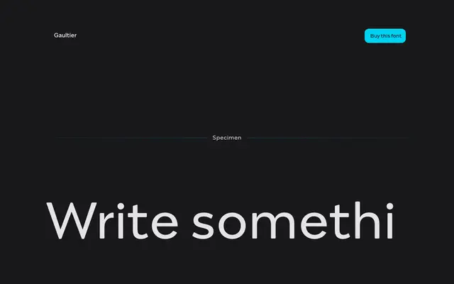
A humanist sans-serif drawing on Garamond, Granjon and Eric Gill, built across ten weights with matching italics for text and branding work.
About
Designed by Mateusz Machalski over five years, Gaultier applies serif-typographic thinking to a sans-serif structure, taking influence from Claude Garamond, Robert Granjon and Eric Gill. Upright styles carry delicate stroke contrast while the italics are more expressive, modelled on Granjon's italic construction. The family ships with small caps, five digit styles, swash variants, ligatures and contextual alternates, aiming at longer text, visual communications and identity work.
Classification
Described by its designer as a sans-serif antiqua drawing on Garamond, Granjon and Eric Gill, with delicate upright contrast and Granjon-inspired italic construction — placing it firmly in the humanist sans tradition.