Geller
Capitalics · Ludka Biniek
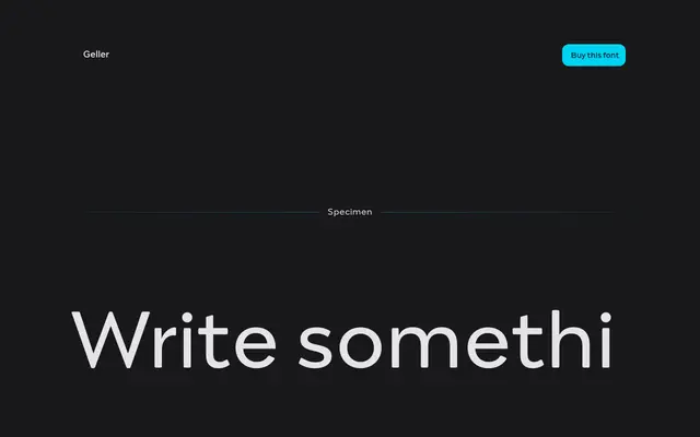
A Didone-influenced editorial serif by Ludka Biniek, designed for newspaper and editorial use across headline and text optical sizes.
About
Originating as a graduation project at Typowa Pracownia, Academy of Fine Arts in Warsaw, Geller draws on Didone proportions for its capital letters, with optimised inner counters, short ascenders and descenders, and a narrow letter construction suited to tight column setting. The family spans twenty styles across two optical sizes, Text and Headline, with weights from Light to Black and matching italics throughout. Bullets, dingbats and compact diacritics extend its usefulness for editorial layouts where entry points and economical typesetting matter.
Classification
Geller draws directly on Didone proportions for its capital letters, with high contrast and narrow letter construction typical of the style, optimised for editorial and newspaper use across headline and text optical sizes.