Hasior
Capitalics · Mateusz Machalski, Weronika Kanigowska, Małgorzata Bartosik · 2023
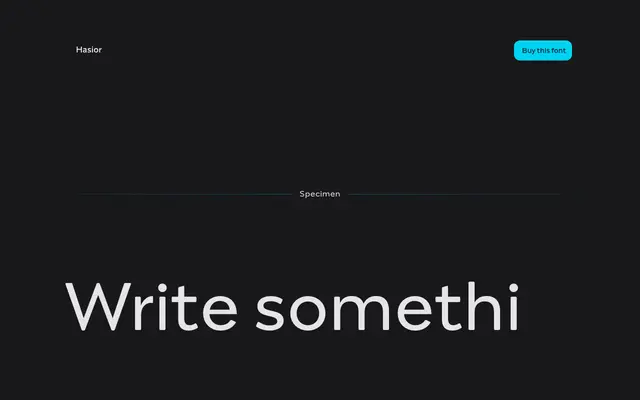
A sharp, high-contrast display typeface drawn from the folk art traditions and mountain aesthetics of Podhale and Zakopane in southern Poland.
About
Designed by Mateusz Machalski with contributions from Weronika Kanigowska and Małgorzata Bartosik, Hasior takes its name and visual cues from the bold, raw artistic language of Polish mountain culture, referencing figures such as sculptor Władysław Hasior and painter Stanisław Witkiewicz. Four weights from Thin to Bold carry the sharp contrasts and dynamic forms suited to posters, large headlines and visual identities requiring immediate expressive impact. The cultural grounding gives it a more specific character than most display serifs aimed at the same applications.
Classification
Hasior is designed explicitly for posters and large-scale headlines, with sharp, dynamic, high-contrast forms inspired by mountain folk aesthetics and the bold visual language of Zakopane artists, placing it firmly in the display category.