Maecenas
Capitalics · Michał Jarociński
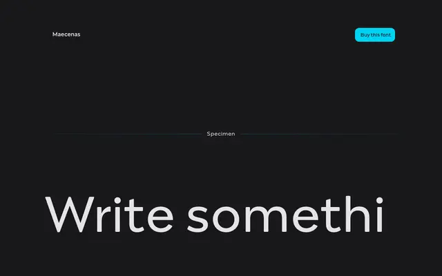
An eleven-weight serif family by Michał Jarociński designed for professional use across editorial and branding contexts.
About
Spanning eleven weights from Thin to Heavy, each with a matching italic, Maecenas is positioned as a versatile workhorse with a formal, elegant character. The specimen demonstrates strong Latin and Cyrillic support, broadening its reach across European markets. Packs are available in editorial and branding configurations, suggesting the family holds up across both running text and display settings.
Classification
The specimen text and foundry copy emphasise elegance, timelessness and professional character, consistent with a transitional serif. The range of weights and italics, combined with the formal tone of the specimen settings, supports this classification.