Mathieu
Capitalics · Mateusz Machalski, Karol Mularczyk, Małgorzata Bartosik
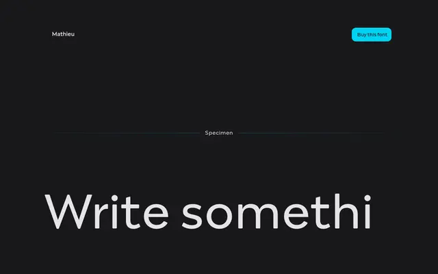
A humanist sans with Renaissance proportions and calligraphic details, designed by Mateusz Machalski at Capitalics with creative input from Karol Mularczyk and Małgorzata Bartosik.
About
Drawing on the texture and elegance of Renaissance typefaces and the balance found in Dutch typography, Mathieu sits between classical warmth and contemporary restraint. Humanistic details give the letterforms a calligraphic undercurrent despite the sans-serif structure, and expressive italics complement the upright styles. The family runs across five weights from Light to Bold and is positioned for both extended text and visual identity work.
Classification
Mathieu is described as a sans-serif with humanistic calligraphic details drawn from Renaissance typeface proportions and Dutch typographic traditions, placing it squarely in the humanist sans category.