Mosir
Capitalics · Mateusz Machalski, Karol Mularczyk, Małgorzata Bartosik
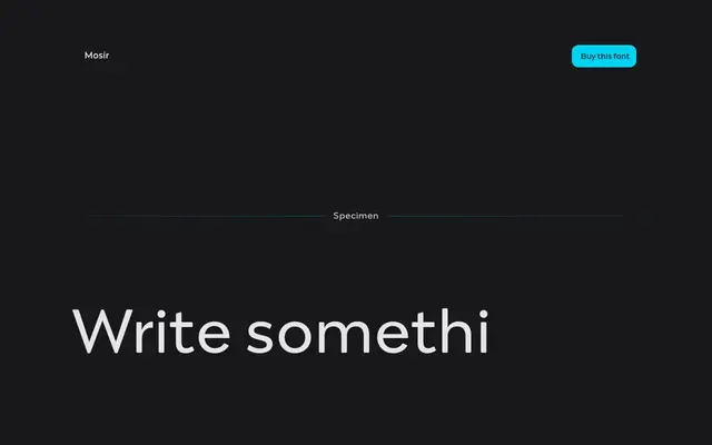
A modular geometric sans inspired by Iranian shop signage and a Polish gym's neon, balancing brutalist structure with rounded, approachable details.
About
Drawn from two real-world encounters, a 'TECHNO' shop display in Iran and a neon sign above a Warsaw gym, Mosir channels the visual logic of signage lettering into a seven-weight type family. Its modular construction and rounded terminals give it a dual quality, reading as thoroughly contemporary or knowingly retro depending on context. Designed by Mateusz Machalski with Karol Mularczyk and Małgorzata Bartosik, it suits display settings where geometric character and a degree of warmth are both required.
Classification
Modular construction with rounded details and strong geometric structure places it firmly in the geometric sans tradition, with an aesthetic that sits between retro and contemporary.