Praho Pro
Capitalics · Maciej Włoczewski
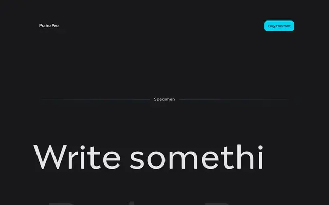
A high-contrast serif inspired by the historic Praga district of Warsaw, designed by Maciej Włoczewski as part of the Warsaw Types collaborative project.
About
Part of a collaboration between 12 young Polish typographers presented at the Museum of Praga, the family draws on the local typographic heritage of Warsaw's Praga district. High contrast, thin serifs, a large x-height and sharp terminals give it a distinctive quality suited to headline work. Nine weights with real italics, small caps, old-style and tabular figures, superscript, subscript and fractions are included, with each weight running to nearly 2,000 glyphs across Latin and Cyrillic scripts.
Classification
High contrast with thin serifs and sharp terminals places this firmly in the high-contrast display serif category, drawing on the visual character of neoclassical or didone-influenced letterforms suited to headlines.