Realise
Capitalics · Mateusz Machalski
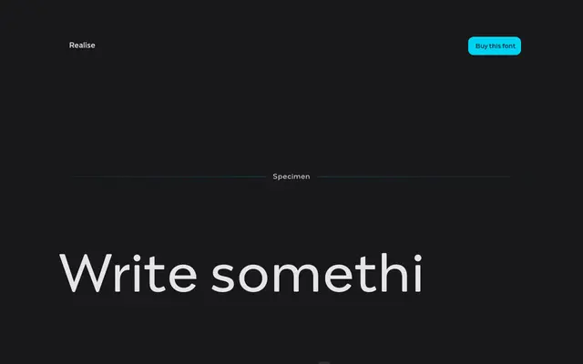
A high-contrast slab serif by Mateusz Machalski that channels Scotch Modern tradition through a deliberately brutalist and experimental lens.
About
Sharp details and experimental minuscule forms give this six-style family a distinct character that sits between historical reference and contemporary severity. The three weights span Regular to Black with matching italics, making the lighter cuts serviceable for body text while Bold and Black push into titles and logotype work. Its Scotch Modern lineage gives it a certain rigour that separates it from more decorative high-contrast slabs.
Classification
The foundry describes Realise as a slab serif drawing on Scotch Modern aesthetics with high contrast and sharp details, placing it firmly in the slab category with a Scotch-influenced subcategory.