Regards
Capitalics · Mateusz Machalski · 2023
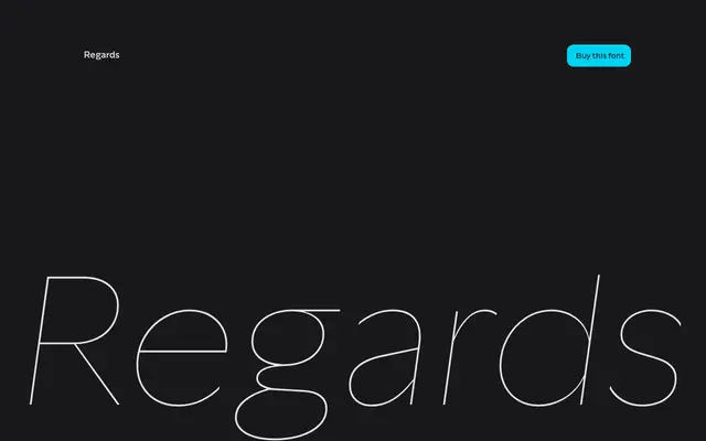
A humanist sans with nine weights and italics, rooted in the Edward Johnston and Eric Gill tradition and shaped by a decade of revision from an earlier typeface called Picadilly.
About
Designed by Mateusz Machalski of Capitalics, Regards grew out of a 2013 typeface inspired by Johnston's London Underground lettering, revised so extensively over ten years that it warranted a new name. The family spans Hairline to ExtraBold with matching italics across 18 styles, plus a variable font, and each weight carries humanistic detail alongside a sharp contemporary edge. Multiple alternate glyphs per character allow for visual experimentation in branding and editorial contexts.
Classification
Rooted in the Johnston/Gill tradition of the London Underground, Regards carries humanistic letterform details with a sharp, contemporary character — placing it firmly in the humanist sans category.