Salo
Capitalics · Mateusz Machalski
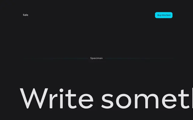
A hybrid type family by Mateusz Machalski that pairs Italian café-signage serifs with modernist road-signage sans in four named styles built on a shared variable-font skeleton.
About
Salo draws from two distinct strands of Italian typographic culture: decorative lettering from café and boutique signs on the serif side, and clean modernist road signage on the sans. The four styles, Paolo, Giorgio, Uberto and Aldo, share the same underlying structure but express it in markedly different ways, and the family is engineered as a 100% variable font. Intended for posters, magazine headlines and branding where mixing styles across the family is part of the intended use.
Classification
Salo pairs a decorative serif style referencing Italian café and boutique signage with a sans variant drawn from Italian modernist road signage, making it a display hybrid rather than a conventional single-category face.