Servus
Capitalics · Michał Jarociński
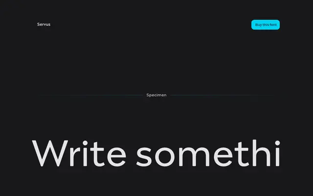
An 18-style sans from Polish foundry Capitalics, conceived around the metaphor of a child growing from thin and narrow to black and wide.
About
Designed by Michał Jarociński, Servus spans nine weights from Thin to Black, each with a matching italic, totalling 18 fonts. The lighter weights are described as well-suited to display work owing to their strong personality, while the Regular provides the even colour needed for longer text. The family covers all Latin languages and includes small capitals, fractions, ligatures and a broad numeral set.
Classification
The page describes a family that transitions from narrow, delicate thin weights to broader, heavier blacks, suggesting a humanist sans with variable personality across the range rather than a strict geometric or grotesque approach.