Seweryn
Capitalics · Ania Wieluńska
displaydisplay serif
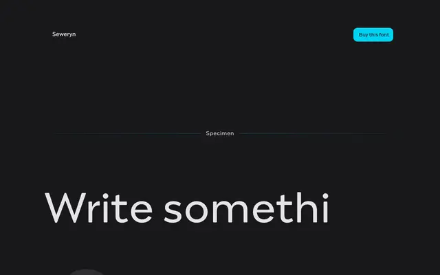
A nine-weight display serif drawing on 1970s Polish graphic design and album art, with high contrast strokes and playful geometry.
About
Designed by Ania Wieluńska at Capitalics, Seweryn takes its personality from Polish design of the 1970s and the visual language of vintage album covers. Nine weights from Thin to Black give it range, while the high contrast and curved forms keep it firmly in headline and branding territory. It suits music-related identity work and retro-modern editorial layouts where a confident, rhythmic serif is needed.
Classification
Described explicitly as a display serif family; high contrast, playful curves and expressive weights position it firmly in the display category rather than text use.
Weights
ThinExtraLightLightRegularMediumSemiBoldBoldExtraBoldBlack
Languages
Latin
Tags
displayserifretro1970shigh-contrastbrandingvintageexpressive