Sigmund PRO
Capitalics · Mateusz Machalski
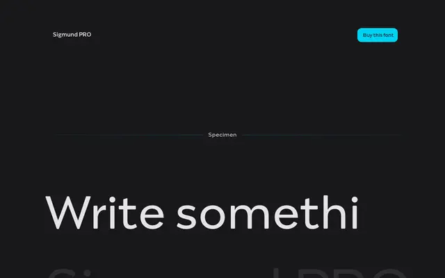
An 18-style family drawn from Polish road signage lettering, shifting from a functional grotesque at light weights to a geometric display character as weight increases.
About
Designed by Mateusz Machalski at Capitalics, the family takes Marek Sigmund's Polish road signage typeface as its starting point, evolving through nine weights and matching italics into something closer to vernacular street-sign display typography at the heavy end. The span from Thin to Heavy gives it range across identity, editorial and poster work. Alternative characters add flexibility for branding applications.
Classification
Rooted in Polish road signage lettering by Marek Sigmund, the family transitions from a signage-derived grotesque at lighter weights into a geometric display character at heavier weights, sitting broadly within geometric sans-serif territory.