Tzimmes
Capitalics · Michał Jarociński
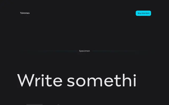
A fleshy, calligraphically inflected serif from Capitalics, spanning 22 weights with true italics for editorial and branding work.
About
Designed by Michał Jarociński, Tzimmes pairs pronounced serifs with calligraphic undertones and strong stroke contrast across an unusually wide weight range from Thin to Heavy. The lighter and bolder extremes suit display and logotype work, while the middle weights hold up well in long-form text. Latin and Cyrillic coverage is included alongside small capitals, fractions, ligatures and a full suite of OpenType features.
Classification
The page references 'fleshy serifs' and 'subtle calligraphic references', placing Tzimmes in the transitional serif tradition with humanist calligraphic influence and pronounced stroke contrast.