Yalla PRO
Capitalics · Mateusz Machalski
displayfuturistic display
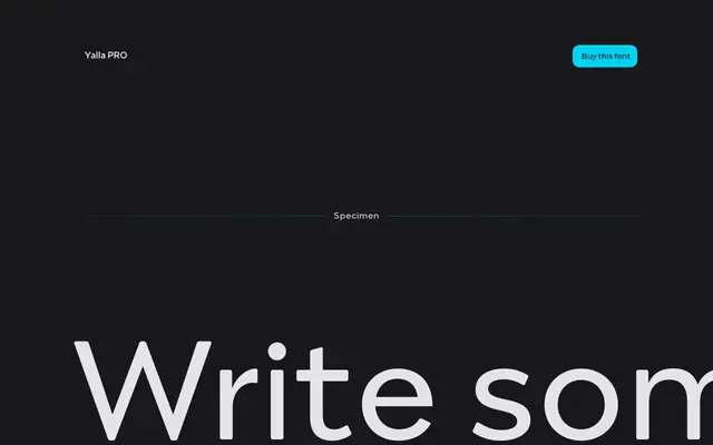
A seven-weight display family from Capitalics with futuristic letterforms suited to branding and headline work.
About
Designed by Mateusz Machalski at Capitalics, Yalla PRO spans seven weights from Thin to Bold with no italics. Its specimen copy references futuristic forms, suggesting a constructed, unconventional Latin display character. The family is positioned for branding and expressive editorial contexts rather than extended text setting.
Classification
The specimen text references 'Futuristic Forms' and the letterforms appear to be a decorative display typeface with unconventional, forward-looking construction rather than a neutral text face.
Weights
ThinUltralightLightRegularMediumSemiBoldBold
Languages
Latin
Tags
displayfuturisticbrandinggeometricdecorativeheadline