Capstone
Carmel Type Co. · Jason Carne
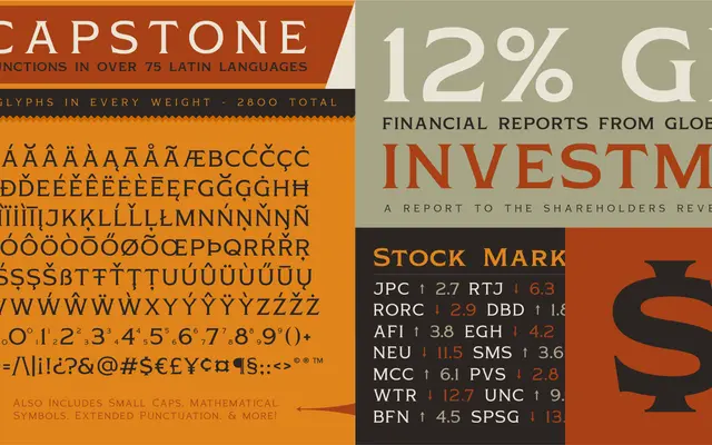
A seven-weight low-contrast serif drawing on classic Roman letterforms and the vernacular of early to mid-20th century packaging and ephemera.
About
Designed by Jason Carne, Capstone spans from Hairline to Heavy across seven weights, making it useful for both delicate captions and bold headline work. The low-contrast serifs carry a vintage warmth rooted in early 20th century packaging and print ephemera rather than formal typography traditions. Each style ships with over 400 glyphs including small caps, supporting 75 or more Latin-based languages.
Classification
Capstone draws on classic Roman letterforms with stylish low-contrast serifs, placing it in a transitional zone between oldstyle and display serifs with a vintage ephemera character.