Deutscher Apotheker Verlag
Character Type · Henning Skibbe, Oleksandr Parkhomovskyy, Anja Meiners · 2025
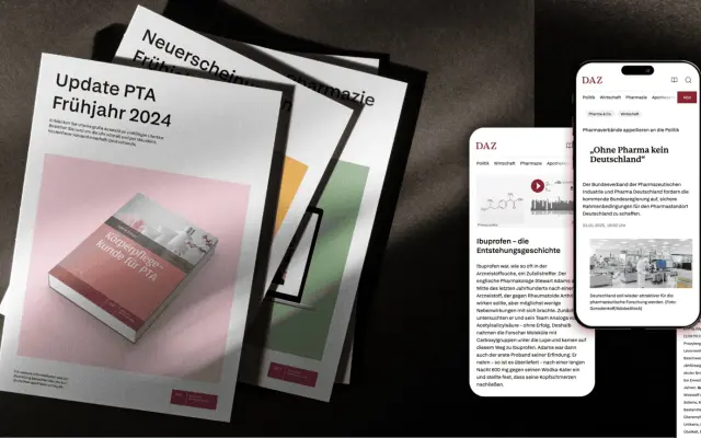
A bespoke two-family system designed by Character Type for Stuttgart-based pharmaceutical publisher Deutscher Apotheker Verlag, covering Latin, Cyrillic, Greek and the international phonetic alphabet across 830 glyphs.
About
Named after DAV founder Schmiedel, the two families — Schmiedel Sans and Schmiedel Serif — were created for deployment across all corporate communication and a growing range of publishing products, from the weekly Deutsche Apothekerzeitung to encyclopedias and digital platforms. The character set of 830 glyphs supports 200+ languages including full IPA coverage, a requirement driven by DAV's pharmaceutical reference publishing. The project was developed in partnership with Stuttgart design studio Wessinger und Peng, who led the 2025 redesign of the DAZ journal.
Classification
The project comprises two families, a sans and a serif, both designed for pharmaceutical publishing. The sans is classified as humanist given its text-oriented purpose and editorial application across books, journals and digital platforms.