Early Sans™
Character Type · Henning Skibbe, Oleksandr Parkhomovskyy
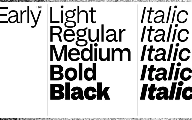
A modern grotesque drawn from an 1894 Breite Grotesk specimen, softened and updated for contemporary brand and screen use.
About
Designed by Henning Skibbe and Oleksandr Parkhomovskyy, Early Sans takes its general softness from Wilhelm Woellmer's 1894 Berlin specimen but redraws proportions and letterforms for modern applications. Subtle 2-degree curved instrokes on letters such as n, m and r act as gentle ink traps, aiding readability at small sizes. The family spans five weights with matching italics and a variable font, sharing vertical metrics and glyph sets with its companion family, Late Serif.
Classification
Inspired by late 19th-century Breite Grotesk specimens, Early Sans is a modern grotesque sans-serif with soft curves and ink-trap-like instrokes characteristic of early German and British grotesque traditions.