EatHappy
Character Type · Alan von Lützau (creative direction), Character Type · 2021
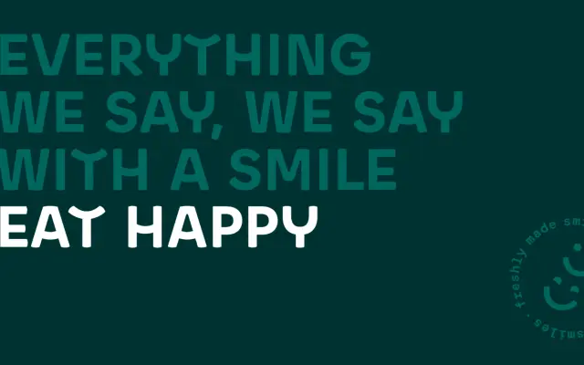
A brand-commissioned headline typeface built on geometric construction, where each letterform is drawn with upturned curves to express the smiling character of the EatHappy sushi chain.
About
Designed in 2021 as part of a brand redesign by Korefe, it takes geometric round O forms and classic width proportions as its structural foundation, then inverts the horizontal stroke weight distribution — a nod to typefaces such as Neutraface — to reinforce a warm, upward-curved rhythm across the alphabet. The family comes in two versions: Basic, and Pro, which includes alternative, more eccentric glyph shapes accessed via the lowercase character slots. The glyph set is deliberately lean, covering uppercase headline use only.
Classification
An uppercase headline typeface built on geometric construction with round O forms and classic proportions, designed expressly for display use in a brand context with exaggerated smiling curves as a defining formal conceit.