Lamborghini
Character Type · Henning Skibbe, Oleksandr Parkhomovskyy, Philipp Neumeyer, Jakob Fangmeier
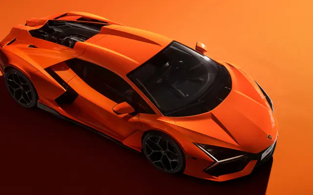
A bespoke neo-grotesque family designed by Character Type for Lamborghini's brand redesign, spanning three widths and four weights across 205 languages as a single variable font.
About
Developed as part of Lamborghini's brand overhaul led by Strichpunkt, Lambotype draws its visual character from the marque's design language: 12-degree angled terminals referencing aerodynamic body lines, geometric forms derived from hexagons and three-armed stars, and deep ink traps that introduce rhythm and warmth. Three widths from Normal to Ultracondensed and four weights from Light to Black yield 24 styles, all delivered within one variable font. Latin Extended, Cyrillic and Greek coverage across 205 languages gives the family the range a global automotive brand requires.
Classification
Described explicitly as Neo-Grotesk, with geometric base shapes and distinctive angular terminals; sits within the broad grotesque/neo-grotesque tradition but with bespoke, brand-specific design gestures.