Lapidar
Character Type · Henning Skibbe · 2024
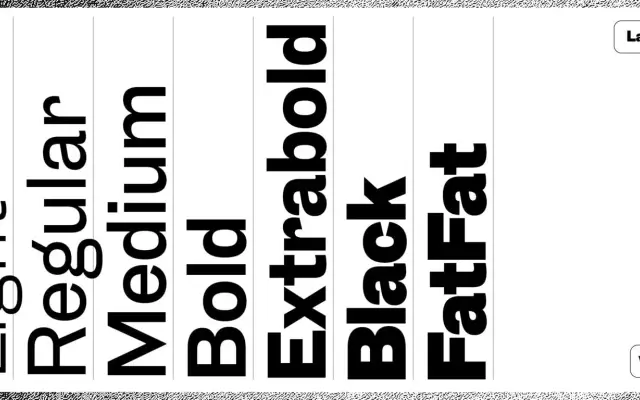
A revival of a Genzsch & Heyse grotesque from 1874/75, extended by Henning Skibbe into a seven-weight family that preserves the original's idiosyncratic terminal angles.
About
Based on an uppercase-only typeface issued by the Hamburg foundry Genzsch & Heyse in 1874/75, this revival deliberately retains the inconsistent terminal angles across letters such as a, c, e, s and r that characterise the source material, while correcting proportional oddities like the abnormally narrow A and M. The family spans Light through Black plus an additional monolinear FatFat weight, the heavier cuts designed without any historic model to guide them. Italics and a possible condensed subfamily are noted as forthcoming at version 0.3.
Classification
A revival of a late 19th century German metal type grotesque, monolinear in character with inconsistent terminals preserved from the historic source; classified as grotesque sans-serif given its origins in the German metal type tradition of the 1870s.