Late Serif
Character Type · Henning Skibbe, Oleksandr Parkhomovskyy
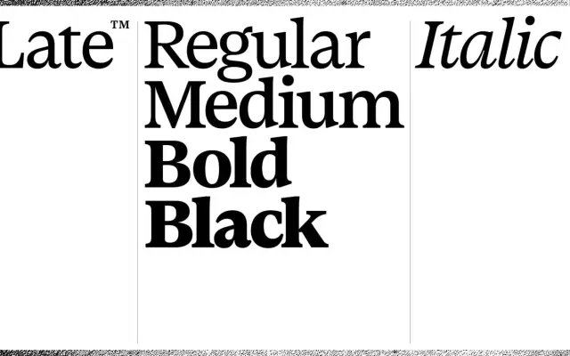
A contemporary text serif referencing Gill's Perpetua, with organically flowing strokes and a variable stroke contrast suited to both small text and display settings.
About
Designed by Henning Skibbe and Oleksandr Parkhomovskyy, Late Serif takes Perpetua as a loose historical reference while softening the delicacy of its stroke contrast and introducing sickle-like expanding terminals that recur across the character set. Five styles cover Light through Black plus a single italic, with the italic construction most distinct in Q, g, k and y. Coverage extends to Latin Extended, Greek and Cyrillic, supporting over 210 languages.
Classification
Late Serif references Eric Gill's Perpetua, a typeface rooted in transitional and lapidary serif traditions. The shifting stroke contrast from diagonal to upright and the organically flowing terminals align it with transitional serif conventions, updated for contemporary screen and text use.