Tragic Grotesk
Character Type · Henning Skibbe
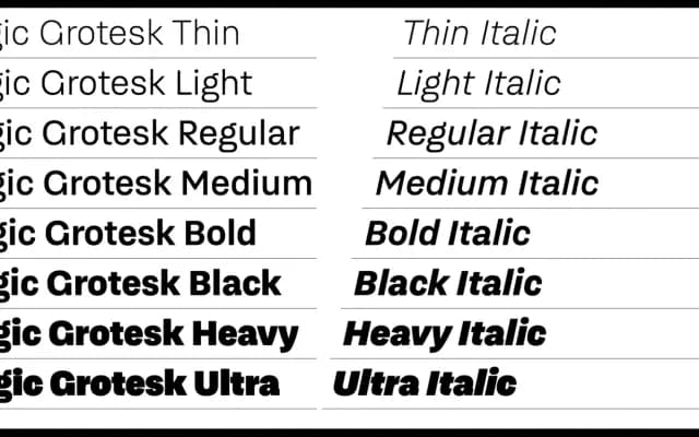
A 16-style grotesque by Henning Skibbe that deliberately bridges warm, humanist qualities with DIN-style technical rigidity across eight weights from Thin to Ultra.
About
Semi-open apertures on letters like a, c, e and s, slightly slanted stroke terminals and gently curved diagonals on A, K, V and similar characters give the family a calligraphic undertone without sentimentality. DIN-influenced straight segments are injected into otherwise round forms, creating a controlled tension that the designer describes as a mediating act between warmth and technical directness. Each of the 700-plus glyph styles includes small caps, tabular and circled figures, arrows and alternate forms for characters such as a, G and l, making it well-suited to corporate identity, editorial and screen applications.
Classification
A contemporary grotesque drawing on pre-Helvetica late 19th-century grotesque references, with semi-open apertures, slightly slanted stroke endings and DIN-influenced straight elements blended into rounded forms.