Mattone
Collletttivo · Nunzio Mazzaferro · 2018
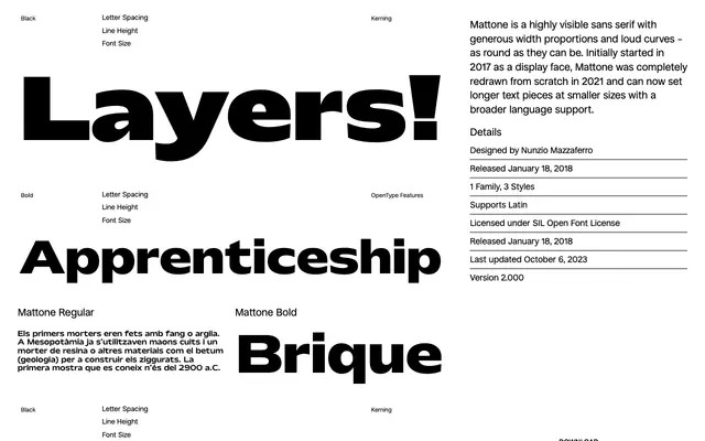
A wide, round geometric sans with three weights, redrawn in 2021 to extend its range from display to smaller text sizes.
About
Originally conceived as a display face in 2017, Mattone was rebuilt from scratch in 2021, gaining broader language support and improved text performance at smaller sizes. Its defining character comes from generous width proportions and curves pushed as far toward circular as possible. Three weights — Regular, Bold and Black — are available under the SIL Open Font Licence.
Classification
Mattone is a sans-serif with pronounced geometric qualities, characterised by maximally round curves and generous widths. Its display origins and loud proportions align it with geometric sans conventions rather than humanist or grotesque traditions.