Messapia
Collletttivo · Luca Marsano · 2019
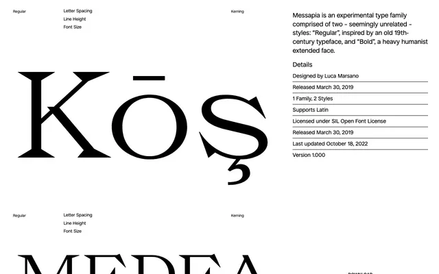
A two-weight experimental family that deliberately pairs a 19th-century-inspired Regular with a heavy humanist extended Bold, treating contrast between styles as a design principle.
About
Designed by Luca Marsano and released in 2019, Messapia holds two styles that would ordinarily belong to entirely different typefaces. The Regular draws on 19th-century precedent, while the Bold takes the form of a heavy, wide humanist serif. Available under the SIL Open Font License, covering Latin with extended diacritic support.
Classification
The family pairs a Regular drawn from a 19th-century serif model with a Bold that is described as a heavy humanist extended face, making it an experimental hybrid that resists a single conventional classification.