Sprat
Collletttivo · Ethan Nakache · 2020
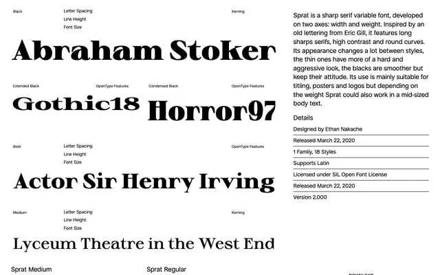
A variable display serif by Ethan Nakache, drawn on width and weight axes with long sharp serifs and high contrast, loosely inspired by Eric Gill's lettering.
About
Running across 18 styles via a two-axis variable font, Sprat shifts character dramatically between extremes: the thin cuts read as hard and aggressive, whilst the blacks soften slightly without losing their tension. Long sharp serifs and pronounced stroke contrast make it well suited to titling, posters and logos, though mid-range weights hold up in larger body text. Released free under the SIL Open Font License.
Classification
A variable serif with long sharp serifs and high contrast between thick and thin strokes, inspired by Eric Gill's lettering. Its extreme contrast and aggressive thin styles place it firmly in display serif territory.