CoFo Cinema1909
Contrast Foundry · Liza Rasskazova · 2020
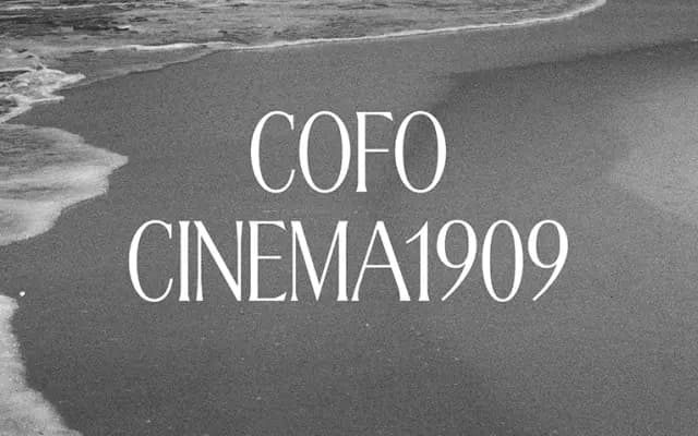
A caps-only display serif by Liza Rasskazova, fusing Latin Art Nouveau and Cyrillic Art Deco influences into a tightly spaced headline face with deliberately dynamic proportions.
About
Designed by Liza Rasskazova and released in 2020, this single-style typeface works exclusively in capitals, with tightly spaced, carefully kerned letterforms built for dense headline texture. The proportions sit between narrow and wide, creating a strong rhythmic pattern reinforced by compact serifs, minimal extending elements and a considered balance of thick and thin strokes. Its dual historical inheritance, drawing on both Latin Art Nouveau freedom and an underdeveloped strain of Cyrillic Art Deco, gives it a character that sits outside any straightforward historical period.
Classification
A caps-only display typeface drawing on both Latin Art Nouveau and Cyrillic Art Deco traditions, with compact serifs, strong thick-thin stroke contrast and dynamic proportions optimised for headline setting.