CoFo FlicFlac
Contrast Foundry · Maria Doreuli · 2020
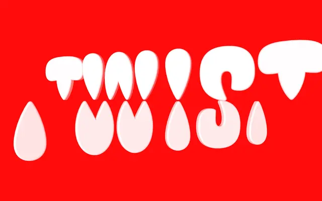
A single-weight display typeface by Maria Doreuli built from water-drop forms that create an illusion of modular repetition while almost no element is truly repeated.
About
Designed by Maria Doreuli and released in 2020, FlicFlac constructs its letterforms from soft, rounded elements that tighten and meet at the centre without touching, mimicking the natural flow of water. Despite the harmonious rhythm that words produce, each character is individually balanced rather than assembled from shared building blocks. The typeface covers Latin and Cyrillic, works at large scale for statement use, generates ornamental text textures at smaller sizes, and its component forms are well suited to motion and animation work.
Classification
FlicFlac is a single-weight display typeface with an organic, modular-like construction built from water-drop forms that deliberately push legibility, placing it firmly in the display category with an expressive, decorative character.