CoFo Glassier
Contrast Foundry · Liza Rasskazova · 2023
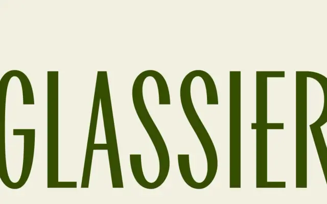
A narrow display serif by Liza Rasskazova drawing on mid-1950s to mid-1960s Soviet typography and American architectural lettering traditions.
About
Designed by Liza Rasskazova and released in 2023, CoFo Glassier pulls from two distinct sources: the graphic typography of the Soviet modernist period and lettering found on American buildings. Its narrow proportions and restrained stroke contrast allow it to function at medium text sizes as well as large display settings. Originally commissioned for Peredelkino, it covers both Latin and Cyrillic scripts in a single Regular style.
Classification
A narrow display face with subtle stroke contrast drawing on mid-century Soviet typography and American architectural lettering, placing it firmly in the display serif category.