CoFo Gothic
Contrast Foundry · Maria Doreuli · 2023
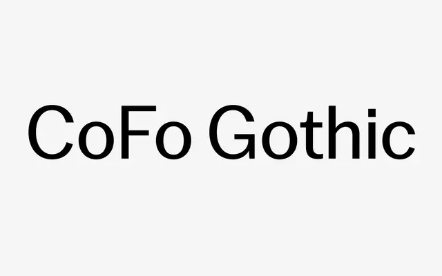
A confident grotesque drawing on 19th-century advertising types, designed by Maria Doreuli with narrow proportions, tight spacing and asymmetrical details that push against neo-grotesque neutrality.
About
Built on the crispness and narrow proportions of early gothic advertising faces, this typeface deliberately reintroduces warmth through asymmetric details and large lowercase letters rather than ironing them out. Twelve styles run from Thin to Black with matching italics, and a variable font is available alongside the static cuts. Suited to branding, editorial and packaging where a sans needs character without tipping into decoration.
Classification
CoFo Gothic draws directly from 19th and early 20th century grotesque advertising types, with narrow proportions, tight spacing and increased contrast typical of that tradition, updated with contemporary detailing.