CoFo Holz
Contrast Foundry · Nikita Sapozhkov · 2024
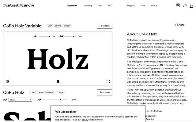
A variable display serif drawing on 18th-century engraving and American wood type, contrasting triangular wedge serifs with circular terminals across seven weights.
About
Designed by Nikita Sapozhkov and released in 2024, CoFo Holz pairs sharply pointed wedge serifs with soft circular dots and terminals, producing a deliberate geometric tension rooted in wood-type tradition. The name references the German word for wood, acknowledging the historical letterforms carved from wooden blocks that inform its exaggerated serifs. Seven weights from Thin to Black are available as static styles or as a single variable font, with coverage for Latin and Cyrillic scripts.
Classification
Combines wedge-shaped triangular serifs with circular dots and terminals, drawing on 18th-century engravings and American wood type traditions; the modular geometric construction places it firmly in the display serif category.