CoFo Kak
Contrast Foundry · Maria Doreuli · 2020
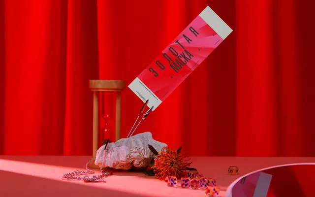
A three-weight sans by Maria Doreuli that deliberately forgoes superfamily conventions in favour of three tightly considered styles spanning condensed to wide.
About
Designed by Maria Doreuli and released in 2020, CoFo Kak covers Latin and Cyrillic in just three styles: Regular, Medium and Black. The family's proportions shift markedly across weights, moving from a condensed upright to a wide Black, giving designers distinct tools to combine within a single typeface. A large x-height, compact ascenders and tight spacing produce a dense, rhythmic texture suited to branding and editorial work.
Classification
A sans-serif with organic, hand-influenced character and an unconventional weight structure that shifts from condensed to wide across just three styles, placing it in the humanist sans tradition despite its geometric compactness.