CoFo Raffine
Contrast Foundry · Olga Kovalenko · 2025
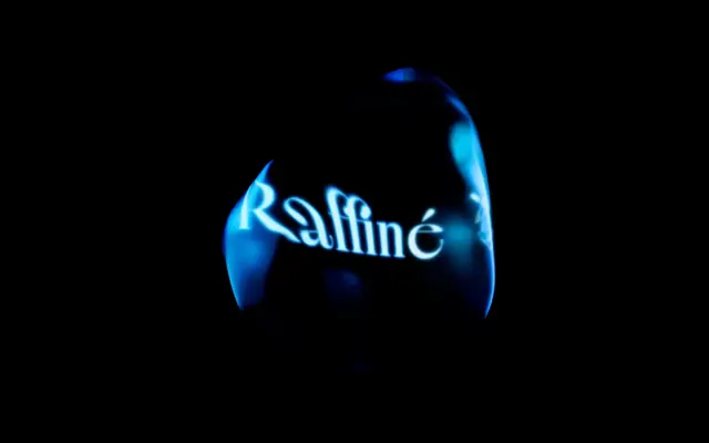
A high-contrast display typeface with deliberately exaggerated, asymmetric proportions, originally inspired by the title lettering of a 1919 silent film.
About
Designed by Olga Kovalenko and released in 2025, CoFo Raffine pairs dramatic variation in character widths with exaggerated individual letterforms and a carefully chosen set of swashes and ligatures. The result is a typeface that reads as deliberately unpredictable at display sizes, drawing on early cinema lettering while arriving at something with its own confident energy. It covers Latin and Cyrillic scripts across five weights from Thin to Bold, with a variable font included in the complete family. Recognised by Communication Arts, Tokyo TDC, Type Directors Club and The One Club for Creativity.
Classification
Described as high-contrast with exaggerated, asymmetric proportions and swashes, designed explicitly for large sizes and expressive typesetting, placing it firmly in the display category.