CoFo Robert
Contrast Foundry · Liza Rasskazova · 2018
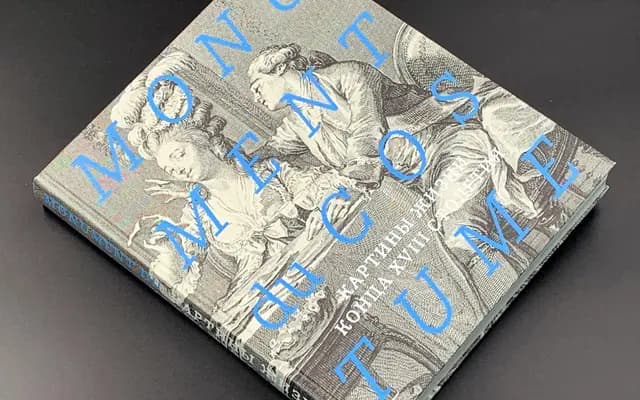
A Clarendon-derived slab serif with sharp curves and expressive italics, named after the style's originator Robert Beasley and released across seven weights.
About
Taking its name from Robert Beasley, who created the first Clarendon typefaces in the early 19th century, this family bridges the mechanical authority of Industrial Revolution display type with a contemporary sharpness in its curves. Fourteen styles run from Light to Black with matching italics, and each includes decorative numbers, arrows, hand glyphs, bullets and small caps. Latin and Cyrillic coverage makes it a practical choice for bilingual publishing and editorial work.
Classification
CoFo Robert draws directly from the Clarendon tradition, named after Robert Beasley who originated the style, with bracketed slab serifs and strong stroke contrast typical of the 19th-century mechanical letter category.