CoFo Robert Sans
Contrast Foundry · Liza Rasskazova · 2026
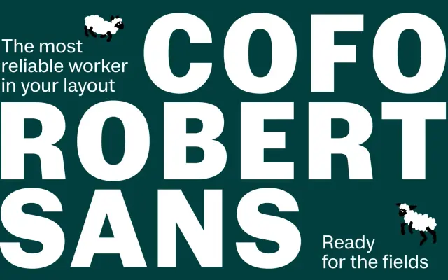
A humanised grotesque by Liza Rasskazova, derived from the serif CoFo Robert, with moderate contrast and softened curves across seven weights for Latin and Cyrillic.
About
Rather than stripping forms to a rational minimum, CoFo Robert Sans takes its structural cues from the serif CoFo Robert, carrying over proportional warmth and moderate stroke contrast into a sans-serif frame. The result sits between a neutral grotesque and a humanist sans, with small caps, superscript and subscript figures, and an extensive character set covering both Latin and Cyrillic. Available as a variable font alongside seven static weights from Light to Black.
Classification
Described by the foundry as a utilitarian grotesque with humanist warmth, derived structurally from its serif counterpart CoFo Robert, with moderate stroke contrast and softened curves rather than strict geometric or rationalist construction.