CoFo Sona
Contrast Foundry · Liza Rasskazova · 2023
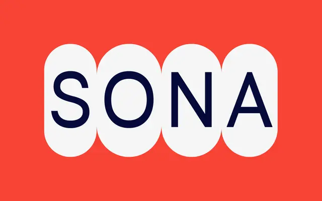
A geometric sans by Liza Rasskazova that tempers its rational structure with humanist proportions and a subtle play of contrasts, available in four weights with Latin and Cyrillic coverage.
About
Released in 2023, CoFo Sona sits in the rational geometric sans tradition while drawing on humanist proportions and detailing to introduce energy and movement into an otherwise orderly framework. The family comes in four weights from Regular to Black, each available as a variable font, covering both Latin and Cyrillic scripts. A reduced character set keeps the scope focused, and the slightly reversed contrast adds a quiet visual tension without disrupting legibility.
Classification
Described by the foundry as a geometric sans with humanist influence; the overall structure is rational and orderly in the geometric tradition, with proportional and detail-level warmth drawn from humanist design.