Fugit
Counter Forms · Dennis Grauel
sans-serifhumanist sansitalic
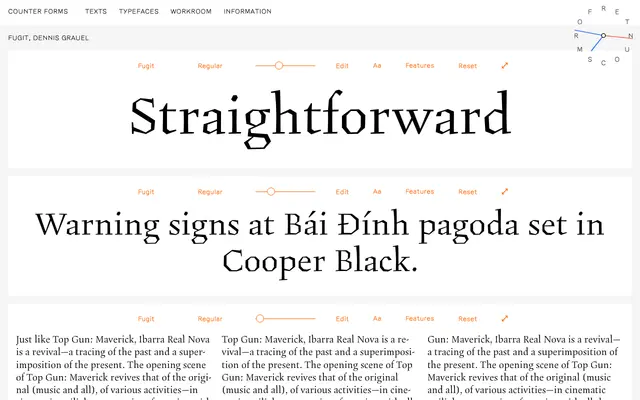
A text-oriented humanist sans by Dennis Grauel, spanning four weights with matching italics for sustained reading environments.
About
Designed by Dennis Grauel and released through Counter Forms, Fugit runs from Regular to ExtraBold across four weights, each paired with an italic. The specimen leans heavily on long-form text settings, suggesting a typeface built for editorial and extended reading rather than display use. Its construction sits within the humanist sans tradition without strong distinguishing quirks.
Classification
The specimen copy and weight range suggest a text-oriented humanist sans. The name and styling indicate a straightforward workhorse design without decorative or display pretensions.
Weights
RegularSemiBoldBoldExtraBold
Languages
Latin
Tags
humanisttexteditorialworkhorsecontemporarylegible