Pantasia
Counter Forms · Wei Huang
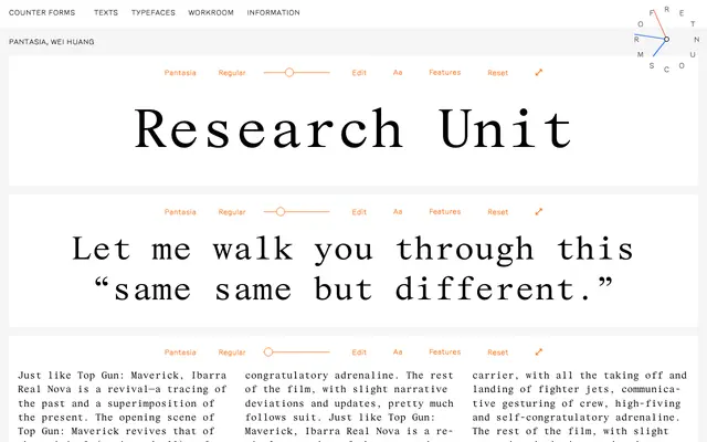
A monospaced serif drawn as a study of Times New Roman's proportions and rhythms, based on the Wide 427 cut issued in 1938.
About
Designer Wei Huang built Pantasia as a means to understand the underlying structure of Times New Roman, working from the Wide 427 cut originally intended for book printing. The exercise strips away Times' associations as a default typeface and isolates the proportional logic that gives it its character, transposed into a fixed-pitch form. Glyph coverage is broad, including extensive Latin Extended characters, Vietnamese, OpenType alternates and a full suite of mathematical and currency symbols.
Classification
Pantasia is explicitly described as a monospaced counterpart to Times New Roman, a transitional serif, making it a monospaced serif. Its proportions and details are derived from the Wide 427 cut of Times New Roman.