Fern
David Jonathan Ross · David Jonathan Ross
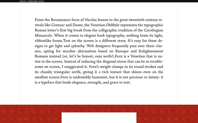
A screen-native Venetian oldstyle by David Jonathan Ross that exaggerates diagonal stress and uses chunky triangular serifs to hold texture at small sizes.
About
Rather than softening the diagonal stress typical of Venetian oldstyles, Ross amplifies it so that weight pools in the round strokes, giving Fern a rich colour even on low-resolution screens. The family spans Text and Micro optical sizes with Regular, Bold and matching italics in each, plus a Titling Caps cut and an Ornaments set, all available as variable fonts with weight and optical size axes. The result is a humanist serif with genuine vigour, suited to long-form reading on screen as much as to print.
Classification
Explicitly positioned within the Venetian Oldstyle tradition descending from Nicolas Jenson, with pronounced diagonal stress and triangular serifs characteristic of Renaissance romans, adapted for screen legibility.