Job Clarendon
David Jonathan Ross · Bethany Heck, David Jonathan Ross, Sophia Tai
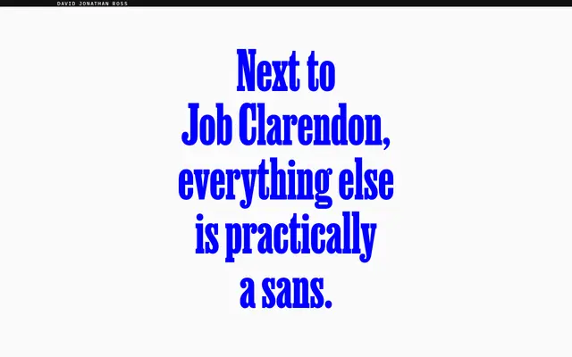
A bracketed slab serif by Bethany Heck and David Jonathan Ross that takes the Condensed Clarendon of 19th century job printing and stretches it across four widths and ten weights, from Hairline to Black.
About
Rooted in the visual language of letterpress job printing, the family spans 40 static styles plus a variable font, with stems growing up to 45 times thicker from Hairline to Black. Four width variants — Skyline, Compressed, Extra Condensed and Condensed — give it a range suited to everything from tight poster headlines to sprawling broadsheet display. Stylistic sets for squared terminals, tailed Rs and simplified letterforms let it shift between a crisp, modern register and a more overtly 19th century character.
Classification
A bracketed slab serif drawing directly from the Condensed Clarendon tradition of 19th century British and American job printing, with heavy serifs, strong contrast between hairline and black weights, and multiple condensed width variants.