Manicotti
David Jonathan Ross · David Jonathan Ross · 2014
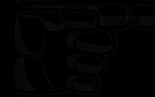
A reversed-stress French Clarendon pushed to decorative extremes, drawing on nineteenth-century wood type and the visual language of Spaghetti Westerns.
About
Manicotti takes the French Clarendon's inverted weight distribution and amplifies it, producing thick horizontal strokes, massive slab serifs and a dense typographic texture that reads as both antique and theatrical. Expanded between 2014 and 2016 to cover Cyrillic and Greek, with Bulgarian and Serbian alternates developed with input from Maria Doreuli and George Triantafyllakos. The typeface has received Certificates of Excellence from the Type Directors Club and the Modern Cyrillic competition.
Classification
Manicotti uses a reversed-stress construction with thick horizontal strokes and massive slab serifs, placing it squarely in the French Clarendon tradition, pushed to a decorative display extreme.