Megabase
David Jonathan Ross · David Jonathan Ross
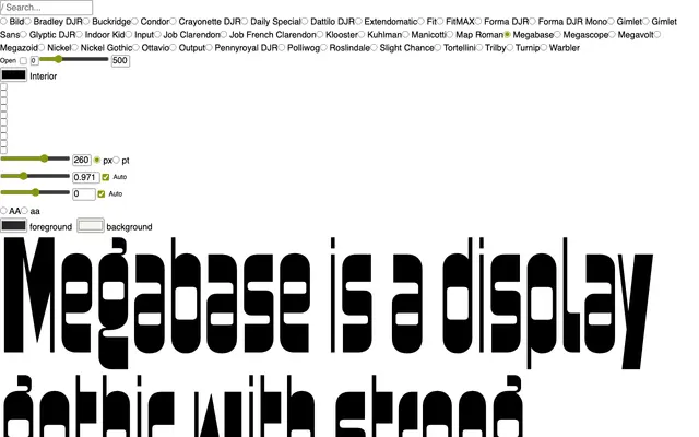
A display gothic that weaponises horizontal stress and optical imbalance, drawing on 19th-century gothics and 1970s space-age lettering from Novarese and Newman.
About
Where most typefaces smooth over uneven typographic colour, Megabase makes a feature of it, letting top-heavy, bottom-heavy and diagonal forms sit conspicuously alongside one another. The design traces its lineage to Gothic Bold and to 1970s display faces such as Novarese's Sintex and Bob Newman's Zipper, pushing their horizontality further than either. Several variant forms for the most disruptive letters give designers control over how much tension they allow into a setting.
Classification
A display gothic with deliberate horizontal stress and optical imbalance, drawing directly from 19th-century gothic lettering and 1970s space-age display typography rather than fitting any conventional text category.