Megascope
David Jonathan Ross · David Jonathan Ross
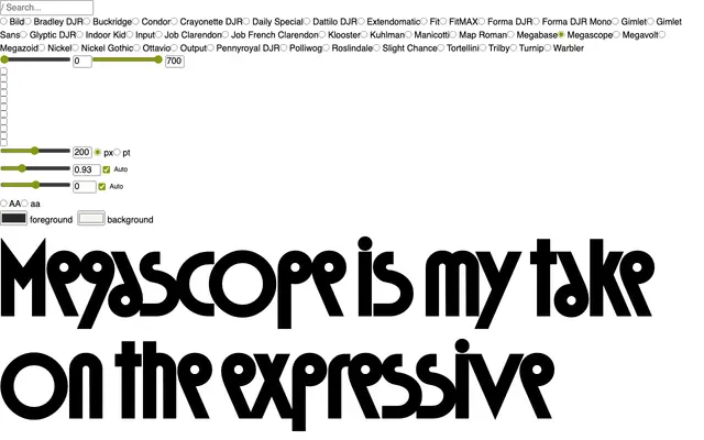
A 1970s Deco-inflected geometric sans with exaggerated proportions, tight spacing and a variable axis that swells its circular forms.
About
Drawn in the spirit of the Deco-inspired geometric sans serifs that decorated sci-fi paperbacks and album covers in the 1970s, Megascope leans into the period's characteristic exaggeration: wide circular counters, a consistent diagonal stroke angle and very tight spacing. A variable axis allows the circular elements to expand further, giving designers direct control over the typeface's most distinctive feature. At its core it is a headline face built for covers, titles and expressive display settings.
Classification
Deco-inspired geometric sans with exaggerated proportions and circular forms; explicitly display-oriented, designed for headlines and expressive use rather than extended text setting.