Turnip
David Jonathan Ross · David Jonathan Ross
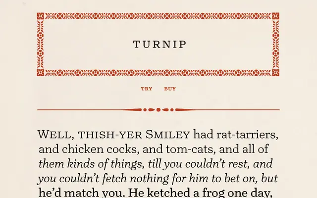
A deliberate roughening of the oldstyle antique tradition, rooted in Bookman and 19th-century display faces, built to set dense, characterful text in print and on screen.
About
David Jonathan Ross drew Turnip out of an appreciation for Bookman and similar faux oldstyle faces from the second half of the 19th century, but worked against their tendency towards static uniformity by setting round outer forms against crisp angular counters, making each letterform slightly off-balance. Six weights with italics run from Light to Black, plus a separate Reading Edge subfamily optimised for small onscreen sizes. The character set extends to stylistic alternates, text figures, small caps, florets, borders, fancy dashes and folio curls, giving the family unusual depth for its rustic register.
Classification
Turnip draws on 19th-century oldstyle antiques and Bookman in particular, with mostly-vertical stress, blobby terminals and angled vertical serifs that place it squarely in the oldstyle antique or 'faux oldstyle' tradition rather than classical old-face.